The place of peace for animal potential
With a grand vision to reshape the agriculture industry, we had the privilege of starting fresh with this bold new Australasia business - curating a name, brand, website, messaging, and design. And it all began with an ideation workshop, defining brand pillars, audience personas, and a tone of voice rooted in science, and warmth.
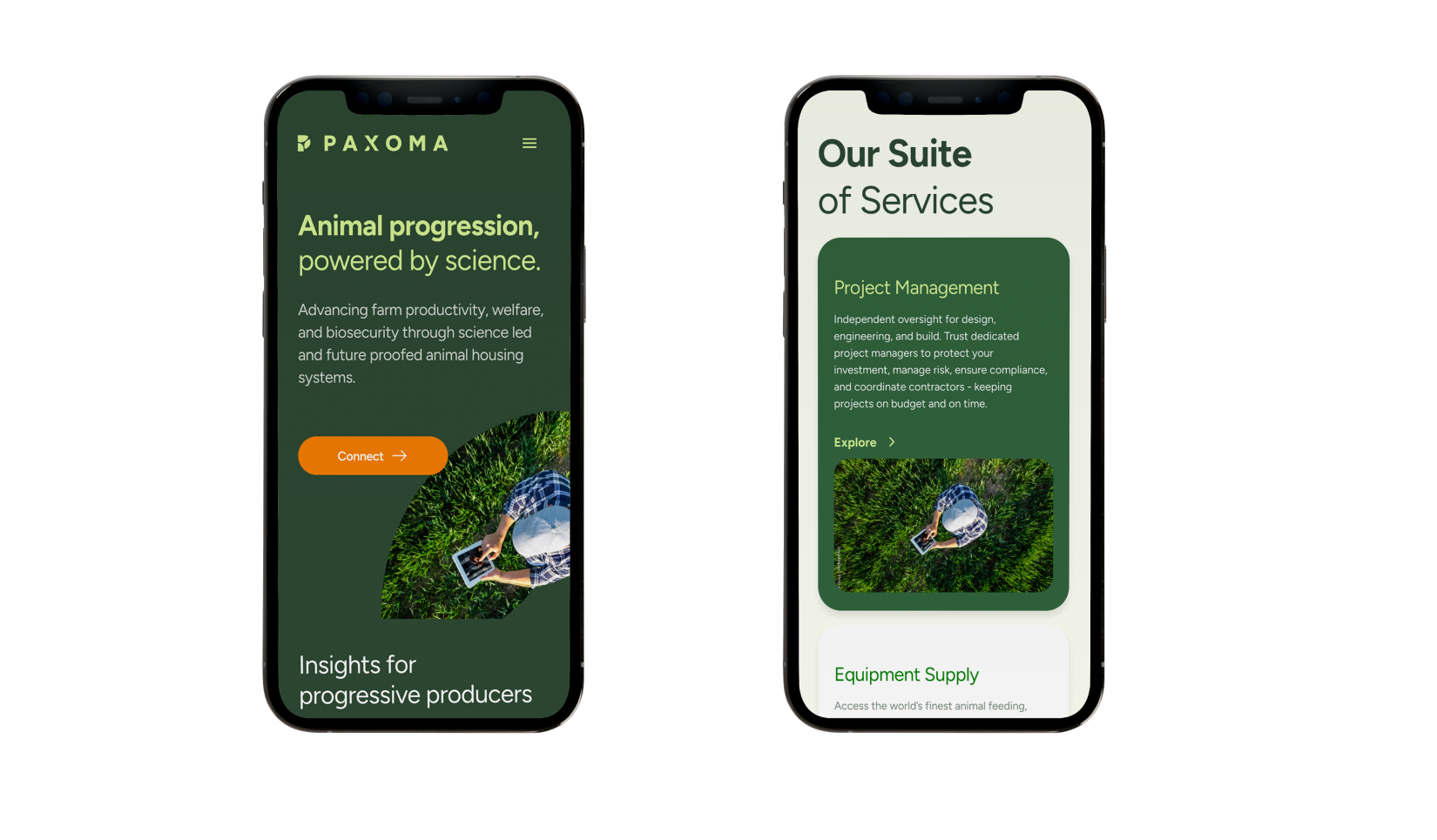
Name ideation came with purpose - Paxoma is derived from the Latin “pax” (meaning peace), paired with the suffix “-oma,” associated with a sense of place, sanctuary, and entity. Balancing traditional and contemporary excellence, Paxoma is effortlessly brandable; rolling off the tongue with international appeal. There’s guardianship, partnership, and progress in the name - affirming a commitment to compassion, science, and innovation.
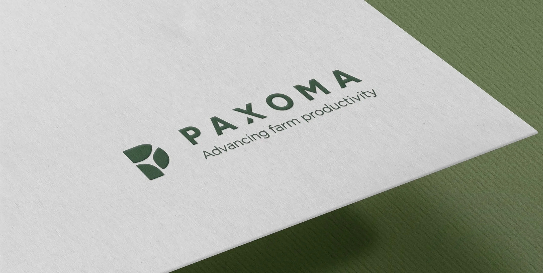
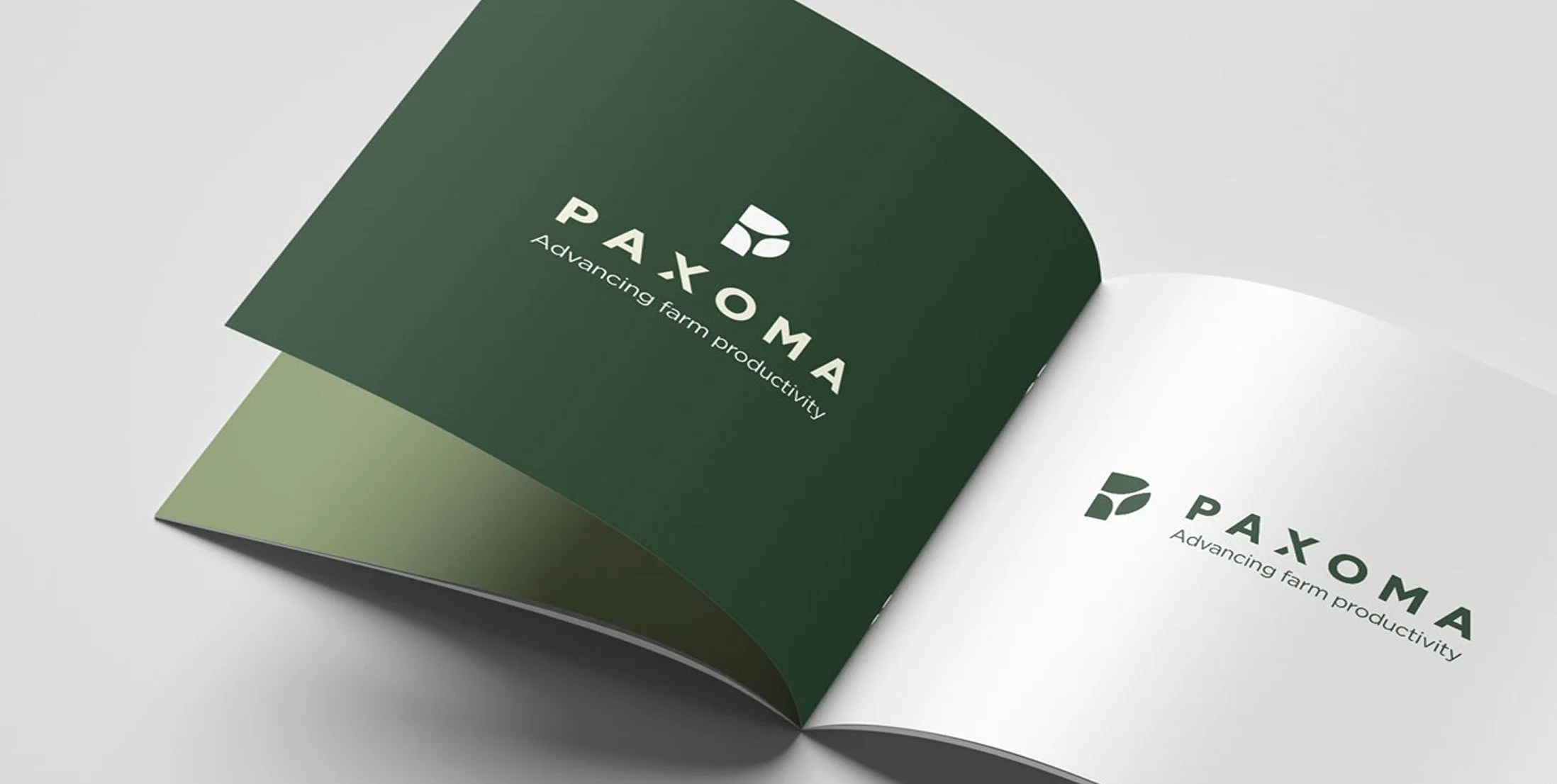
The Paxoma identity weaves together a timeless logo mark - simple, clear, and instantly recognisable. Its composition combines subtle aerial references to farmland and geometric precision, visually expressing the harmony between science, welfare, and progress. A refined, nature inspired palette of tranquil greens and subtle earth tones evokes sanctuary, science, and wellbeing at every brand touchpoint. The design’s strength lies in its adaptability, offering clarity and sanctuary across all platforms and applications, whether displayed in full colour or monochrome. Language is assured, supportive, and solution focused; speaking with confidence, precision, and the authority of industry leaders who genuinely understand.
Deliverables for Paxoma:
Brand Development & Positioning
Brand Naming
Taglines & Key Messaging
Visual Identity System & Style Guide
Discovery Workshop Facilitations
Collateral Suite (digital/print)
Brand Voice Guidelines
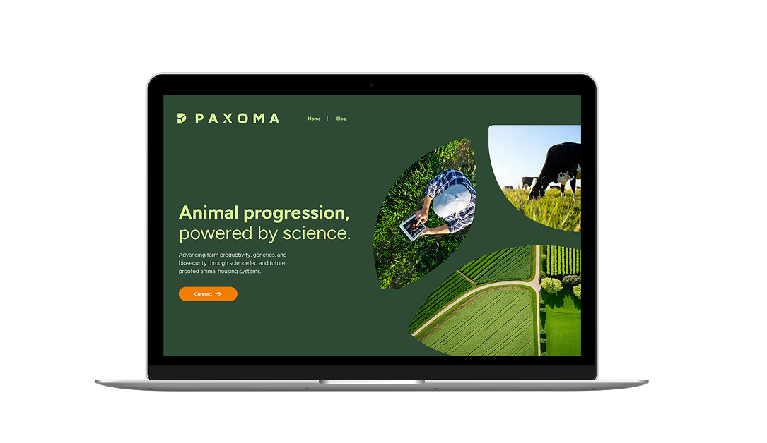
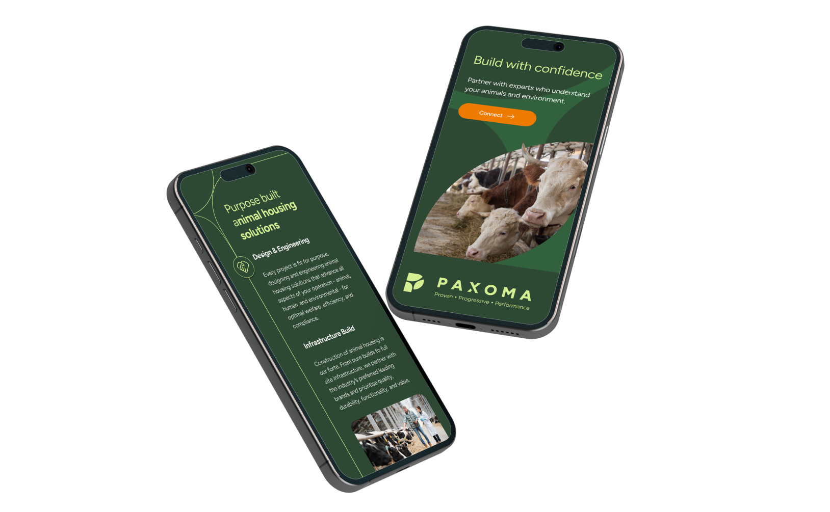
Website