Bringing humanity to the legal table
Central to this family law rebrand and website was a brand strategy workshop, deep diving into audience personas and lived experiences. Together, we clarified the firm’s brand core, defined a distinct tone of voice, and mapped out how Perpetuity Legal needed to communicate, so their digital and tangible brand connected to their ethos.
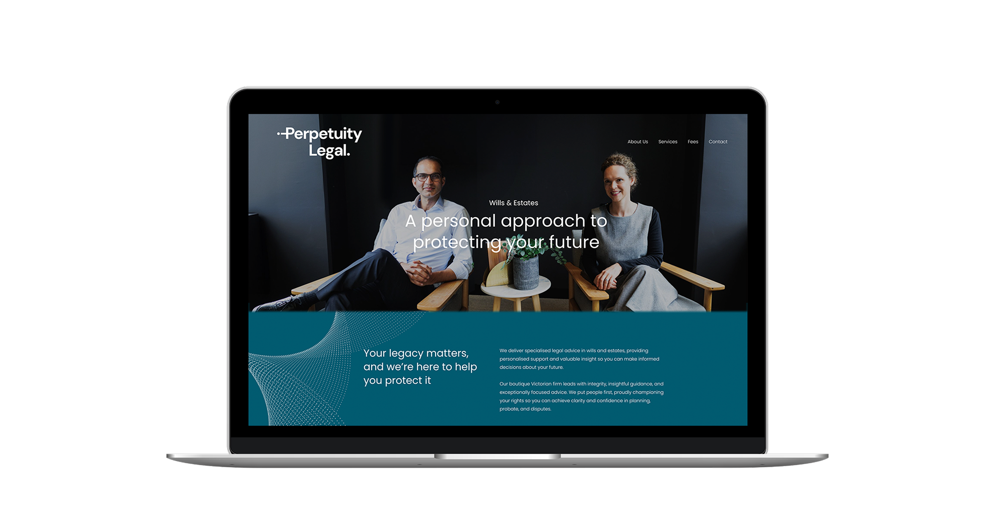
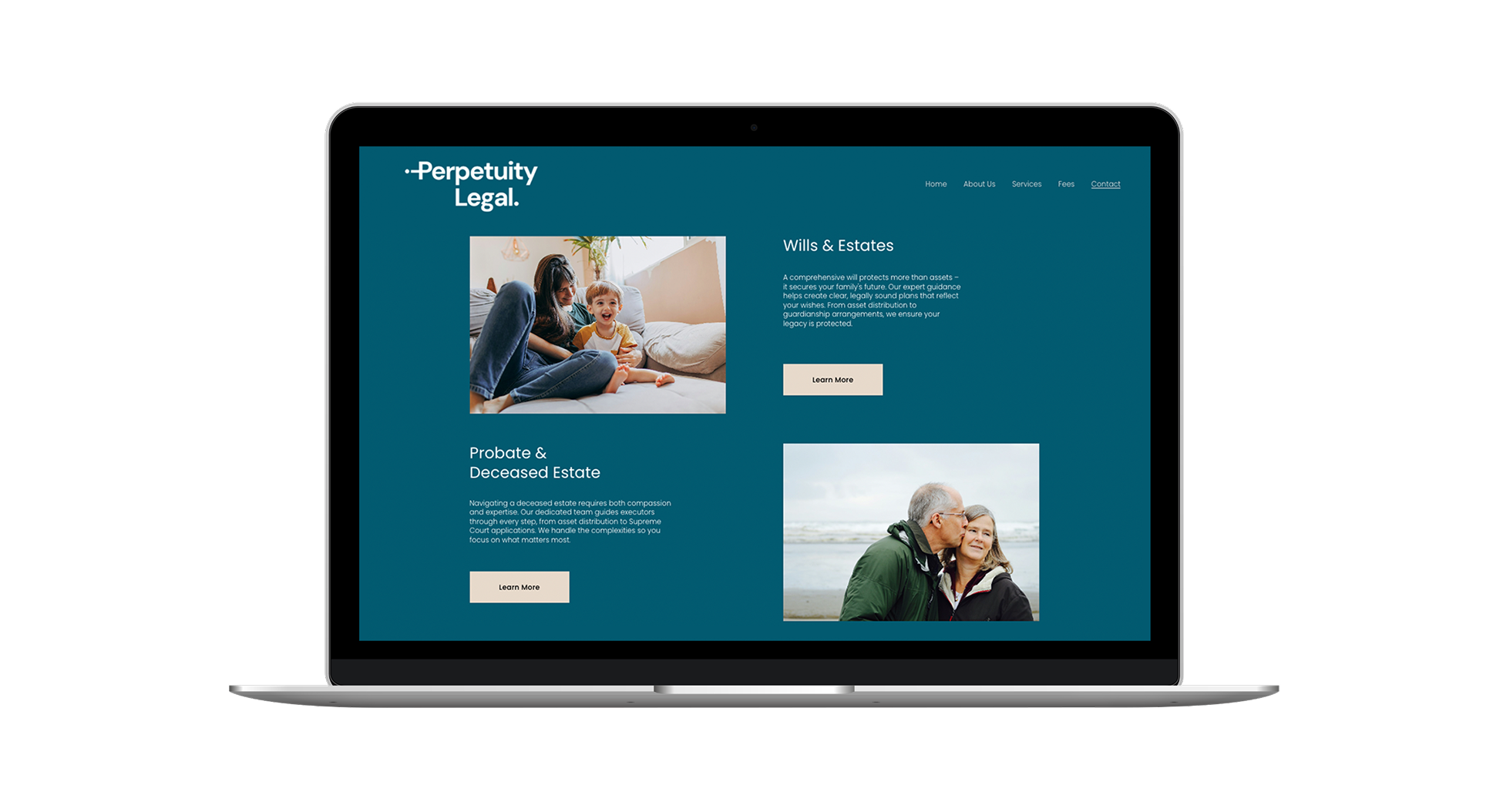
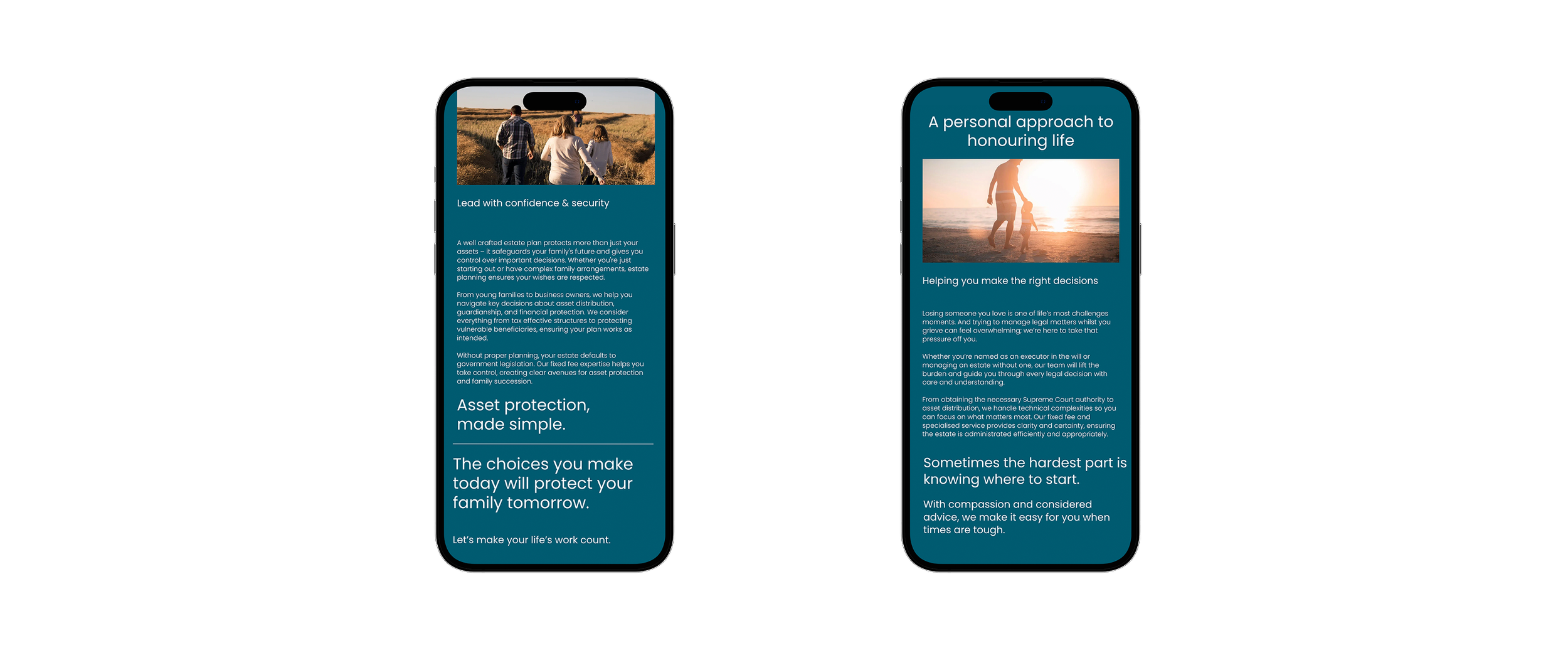
The new brand identity pairs balanced sans serif typography with forms that signal stability and warmth. Our logo design features the distinctive dotting of the 'i' and crossing of the 'P,' a mark that’s both considered and welcoming. The earthy, muted palette and layered graphic textures create a sense of trust, legacy, and modern professionalism that feels both lasting and accessible. Photography was art directed to ensure consistency of brand.
Our copy is clear, inviting, and people focused - centred on every client’s unique needs. We lent into straightforward language to demystify the law, blending authority with openness and empathy. Every message is curated to build trust, provide clarity, and make legal advice accessible - so clients feel valued, understood, and supported throughout their legal journey.
Deliverables for Perpetuity Legal:
Brand Strategy & Positioning
Brand Voice Guidelines
Visual Identity System
Taglines & Key Messaging
Website
Art Directed Photography
Collateral Suite (digital/print)